I designed the Spotify Kid Safe Add-on end-to-end: from a broad exploration of family listening habits through user interviews, competitive analysis, concept testing, and multiple rounds of usability testing. Starting with an open brief, research uncovered a key insight: parents want age-appropriate listening without taking away the joy of discovering music together.
The result is a validated add-on that gives families flexible listening controls while preserving Spotify's social and discovery-driven experience. The prototype showcases three core flows: requesting a song within the child's profile, approving requests from the parent view, and seamlessly transitioning between supervised and independent listening—creating an experience that empowers parents while giving kids the freedom to explore music safely.
Parents and children alike are drawn to the endless amounts of content available on Spotify, but…Spotify’s current experience does not support safe, independent use by children because its interfaces rely heavily on reading ability, with navigation that is complex and text-driven. Parents also struggle to trust the platform because content discovery can surface inappropriate results. However, the biggest barrier we found when it came to independent use wasn't just a safety problem, it was an accessibility challenge. Children were fully dependent on parents for even simple actions.
The truth is, Spotify does have an app for kids!
So… Why weren't families using it?
Working towards a goal
I set out to create an experience that would allow children to navigate and explore independently, parents to control and approve content, and a space where both types of users could feel confident, safe, and in control, all within the original Spotify app.
With a question in my mind, I set out in search of answers.
I began with a series of surveys - putting the question out to 20 potential parent users, with the hopes of pinpointing issues within the current Spotify experience for both children and parents, with a focus on usability and safety.
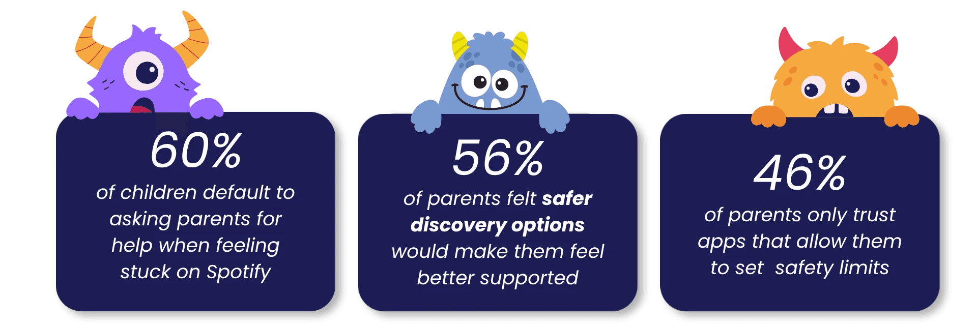
Safety and Independence were the top priorities throughout all of our surveys - but how would we take the existing Spotify app and make it safe enough for parents, and accessible enough for kids?
Especially those who don't read independently?
Next, I conducted a set of research interviews, looking to gain more information from both key user groups- Parents and children
I interviewed 6 potential users- 1 pre-literate child (Age 4), 1 literate child (Age 7), and 4 parents of young children, all of whom are current Spotify users.
4 key patterns emerged across the interviews:
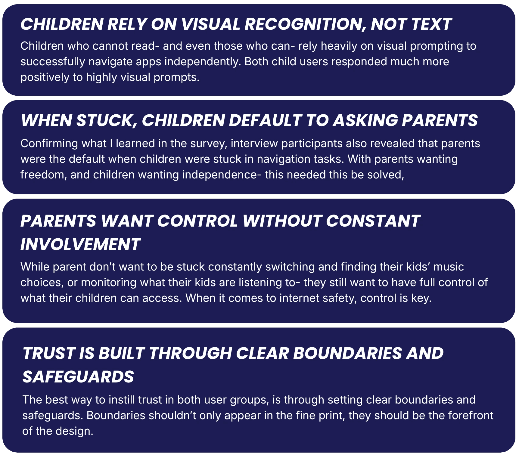
Having narrowed down what issues were being faced by users as a whole- both parents and children- I then shifted my focus to determining which user was the primary user that I needed to solve for.
I created an Empathy Map to narrow down the unique issues being faced by each potential user type, in hopes it would shed some light on the direction we wanted to take. Through the empathy map, I was able to narrow down my target users- Parents and young children.
Parents- because they are (presumably) the owner of the device, and the ones deciding how their child can interact with the app
Younger children- because the gap in their needs remains the largest when looking at what Spotify currently has on offer. As well as because the needs of the younger child can solve for the older child, but not vice versa.
Parents were facing issues of trust, safety and security. While those are important- and definitely needed to be addressed- they weren't the most important.
The research produced two clearly distinct behavioural profiles. Rather than trying to solve for everyone- and thus solving for no one- I looked at who needed the help the most.
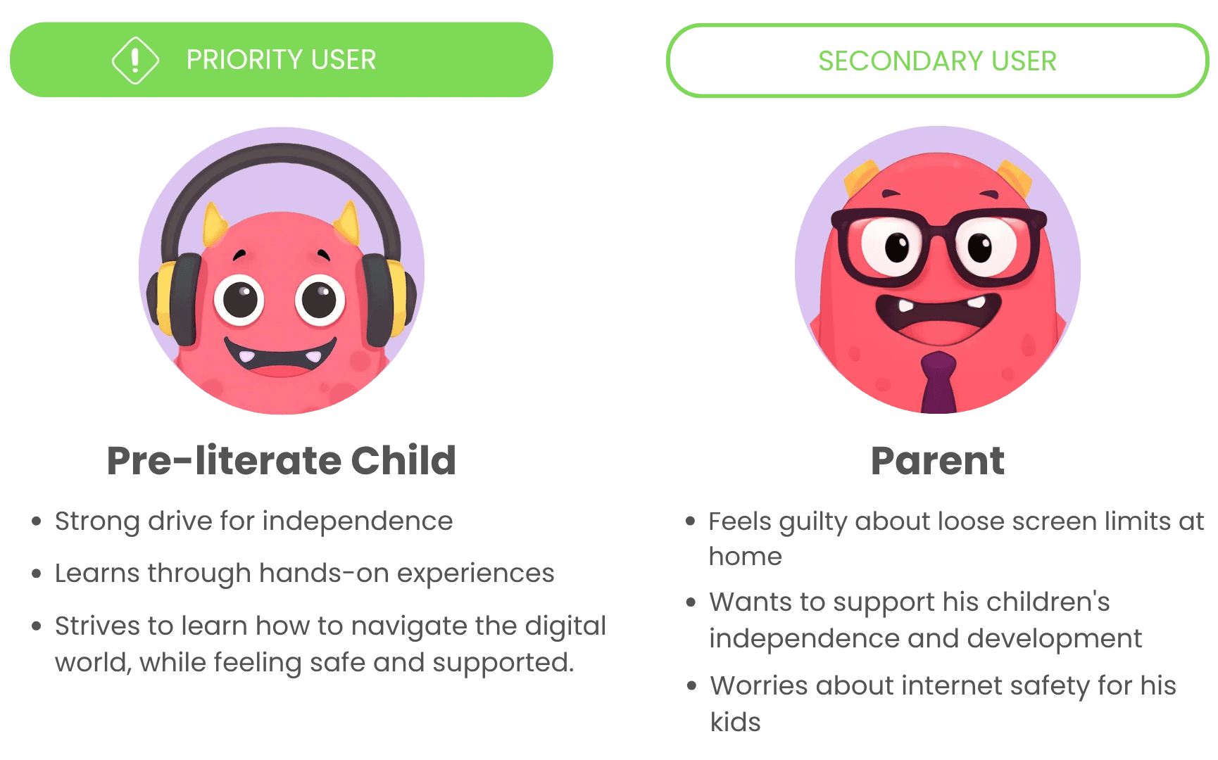
I prioritised designing for the Pre-literate child, because if the child wasn't able to successfully navigate the app independently, the parent's problems around safety and independence no longer existed.
The Child's problem has a clear cause (not being able to read a text-heavy app), a measurable consequence (loss of independence), and a clear design direction- helping non-readers gain independence. The Parent's problem is real, but without solving for the child user, the feature could not be successful.
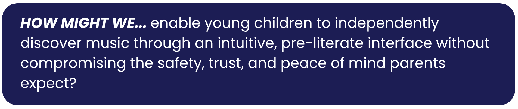
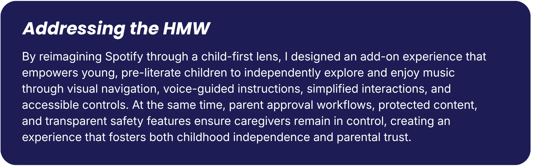
My next challenge was finding a way to design for kids, without losing the feel of the original Spotify App. If I was going to seamlessly integrate a Kids' mode into the existing infrastructure, it needed to be just that- seamless.
I took a step back and examined the existing site map, and then identified ways to bring the new features into the existing infrastructure- not to replace it, but to co-exist.
Having solved the issue of integration, I drafted user flows and task flows for both the adult and child users, keeping the child as MVP, while keeping the original adult flow as close to their current Spotify user flow as possible.
Designing for Young Users
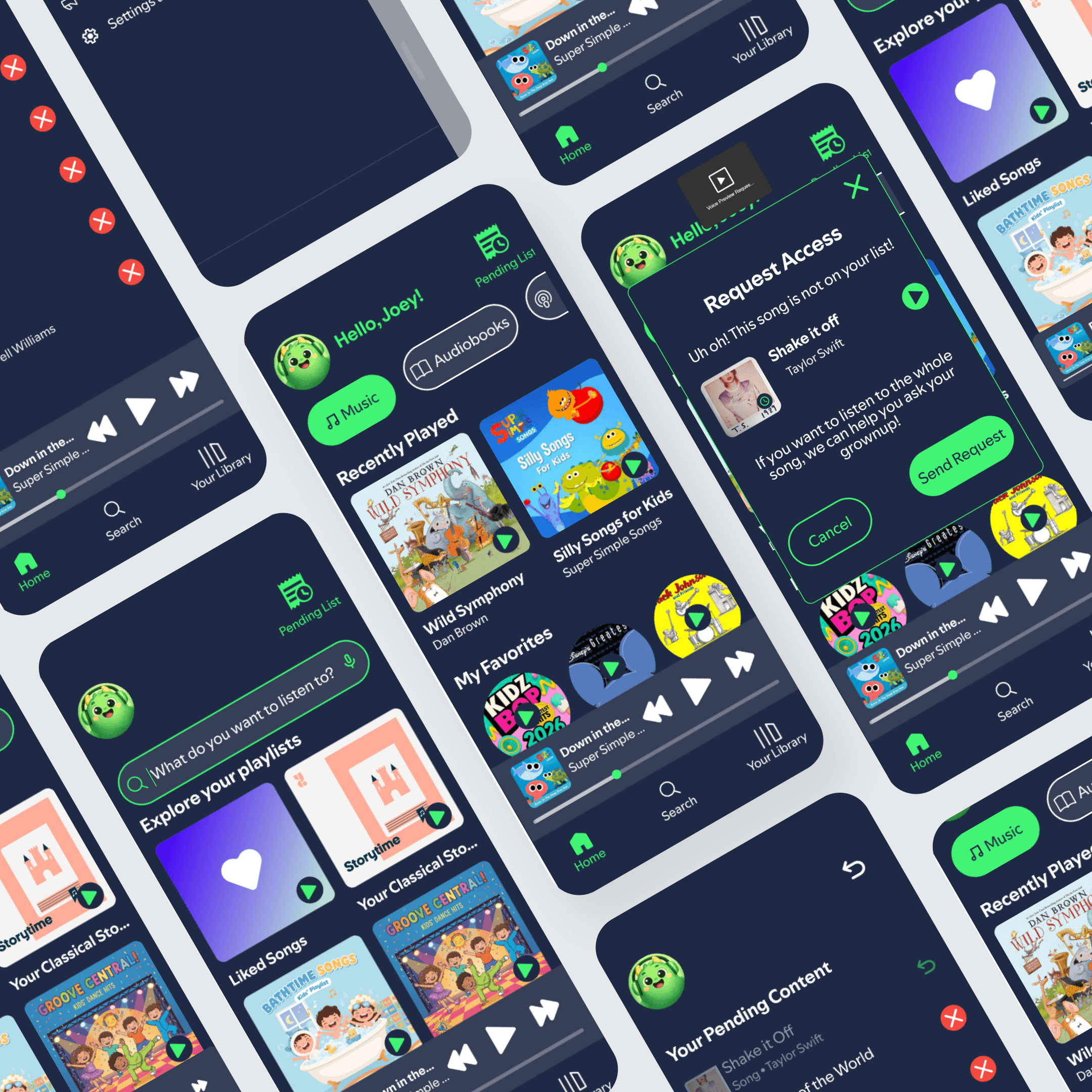
To create a more accessible experience for young children, I reimagined Spotify's interface with their developmental needs in mind. I softened the dark UI by introducing lighter backgrounds to reduce harsh contrast, increased the size of buttons and touch targets for easier interaction, and incorporated playful visuals that make the experience feel more engaging and inviting.
These changes create an interface that is easier to navigate, more intuitive for pre-literate users, and better aligned with how children naturally explore digital experiences.




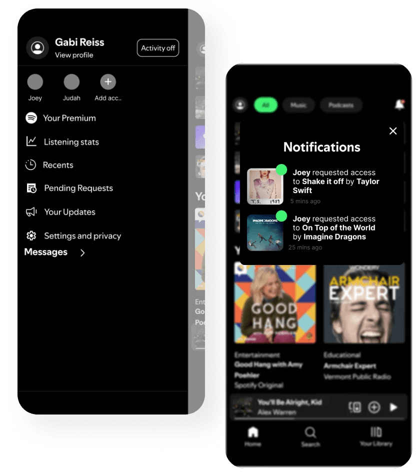


Usability testing was carried out twice- As a low-fidelity, low stakes test, and as a Hi-Fidelity test.
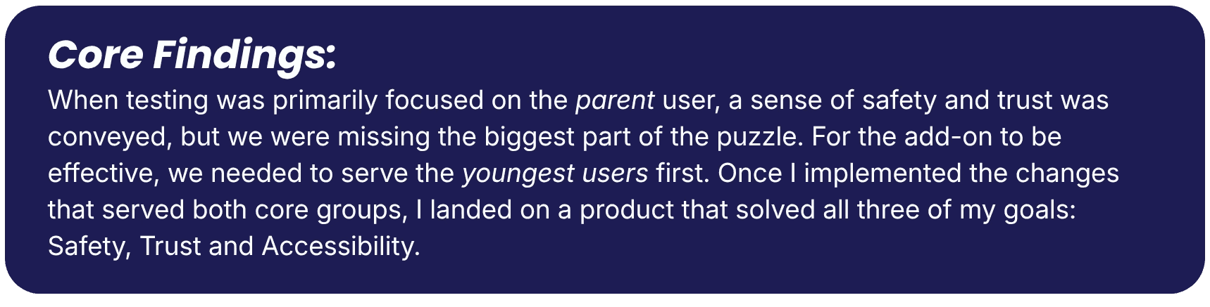
5 main pain points were identified, 3 critical.


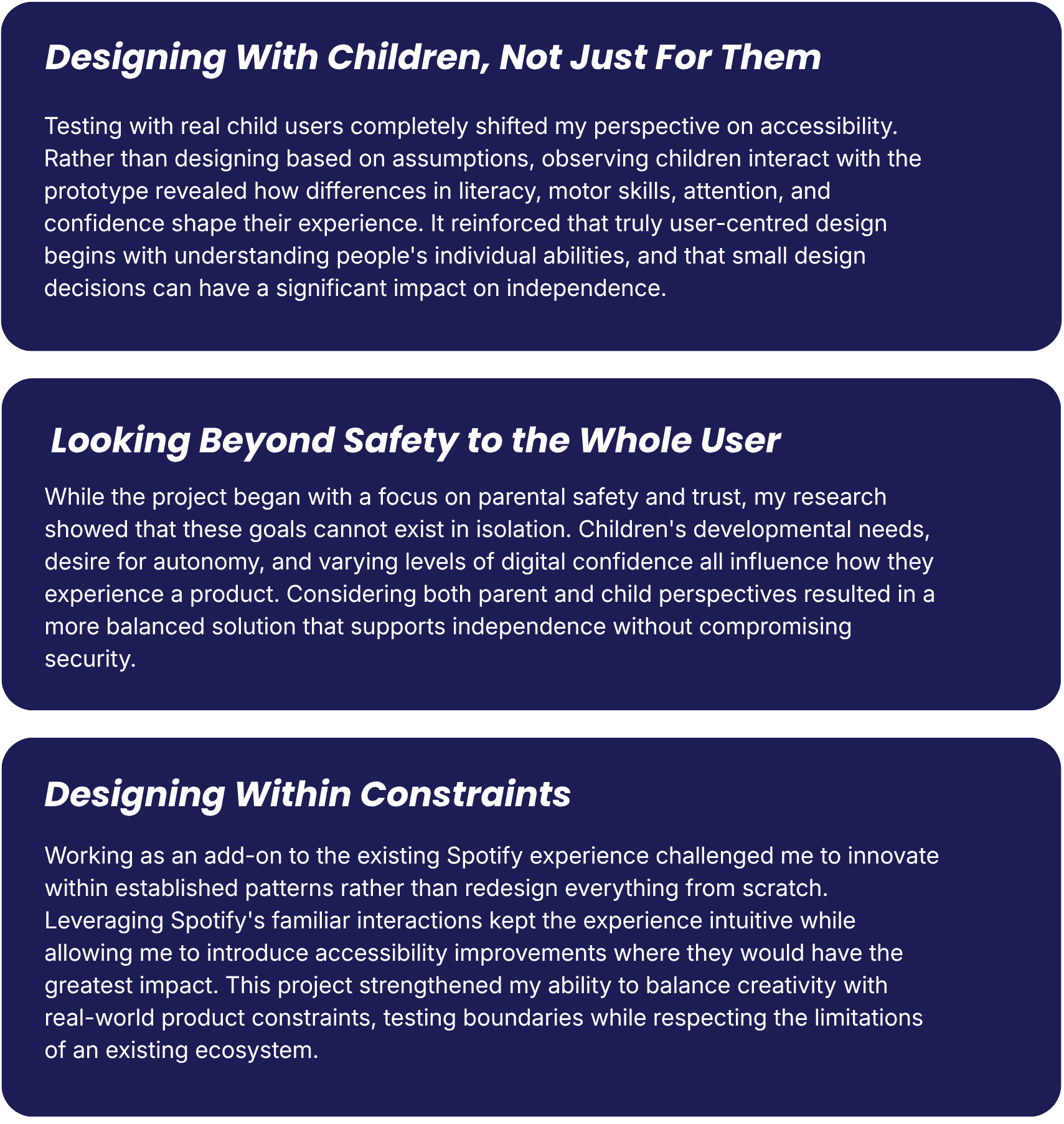
While the current iteration of Spotify Kids Safe meets many of my initial goals and user needs, time constraints limited further exploration, leaving several opportunities for future improvements.